


Have you noticed that law firm web design has become a bit, hmmmm how to put it… predictable? Let’s be honest. These days, a lot of sites look a lot alike.
WordPress templates. SEO tactics. Responsive design. Google analytics. Load speed. Oh my! Out of a whole mess of technical requirements, a cookie cutter approach seems to have emerged. Creativity is getting crushed in favour of function.
But, as long as you get the information people need out there, does it matter?
Internet marketing has become a high-stakes game for law firms. Get this right and there will be a lot less pressure on the rest of your marketing plan.
So, yes, it matters. Quite a bit, actually.
Cookie cutter design blocks prospective clients from getting a true read on the most important consideration when hiring a lawyer. Fit. Consequently, a site that looks and feels like the rest doesn’t just understate your firm’s hard earned, difference. It actually undermines it.
It doesn’t have to be that way.
Not for mid-sized or even small law firm websites.
The difference between a generic and a great lawyer’s website isn’t about big budget, bells and whistles. It’s simply about connecting with your audience, every step of the way.
Whether you’re planning a refresh or a complete overhaul, this roadmap will help you to better envision the many possibilities to do so. Marketing is a lot more effective when it’s not boring.
At Bekhor Management, our approach is focused on what really works to build and enhance small to mid-sized, law firms and other Canadian, professional services firms. We invite you to book an initial consultation if you’re looking for assistance with any aspect of your law firm web design.
A few words about how this law firm web design roadmap is organized:
To make it easy to scan and find examples that relate to the questions you might already be working through, this critique is organized around the following sixteen categories. Please note that where an example fell into more than one category, it was presented multiple times:
- Branding
- Home page
- Design
- Layout
- Animation
- Writing style
- Contact information
- Call to action
- Social integration
- Biographies
- Profiles
- Navigation
- Mobile
- Function
- Content
- Search Engine Optimization (SEO)
Disclaimer about this lawyer website review:
The ideas presented in this lawyer website review are a response to the sites themselves, rather than a factual account of the firms’ actual professional identities.
Please also note that the images and trademark quotes presented in this article are for the purpose of editorial and information.
LAW FIRM WEB DESIGN CATEGORIES
Category #1: Branding

Cooley – Both an animated logo and the firm’s tagline are prominently featured right at the top of the home page. Headlines and messaging throughout the site continue to build on these same key points. Rather than trying to convince the reader that the firm is great at everything, a steadfast focus on innovation comes across as sincere.

Kramer Levin – From the use of colour to the slanted overlay on photos and watermark images, this entire law firm web design takes subtle cues from the firm’s logo. It’s an example of thoughtful integration of a visual identity and it serves to make the firm, the brand and the website that much more memorable.

Seyfarth Shaw – The brand is well presented and explained both on the home and inside pages. As well, the law firm logo appears in the drop down menu for the about us section of the site, a surprising visual that serves to remind the reader which firm’s website they’re perusing.

Jones Day – The power of this law firm’s tagline was multiplied simply by adding a question to the end of it, along with a link to a page with illustrated answers. It didn’t hurt either that the tagline is size gigantic!

Nixon Peabody – Branding a website isn’t just about figuring out ways to use your logo’s colours. This law firm web design has made effective use of the green. But, the reason it is a good branding example is because it echoes the logo’s intended message – inspiration through people – in many, interesting ways. The home page features announcements about the firm’s people. The corporate video uses compelling language like ‘game changing thinking’ and ‘our collective intelligence’, that reinforces the same concepts. They even feature their ‘Chief Innovation Officer’. Together it works.

Goodwin – This diagram on client values, derived from the logo, helps the reader gain insight on what the firm stands for and how it might feel to be a client.
Category #2: Home page

Squire Patton Boggs – The split screen, split colour and split photo is an on-the-ground representation of this law firm’s tagline. It also echoes the creative style of its logo. The colour blocks at the bottom of the page establish continuity with this treatment. This approach is not carried through to the rest of the site. Could it have worked? Maybe. But only if it had been executed in a sophisticated manner, so as not to overdo and dilute the message that’s actually working on the home page. It’s also worth noting that this concept could be refreshed over time, while still staying true to the same intent ie new template, new photos, new colours and even a totally new way of presenting the idea. Same message though.

Hunton & Williams – It’s not a flashy or beautiful home page. But it doesn’t need to be, in order to be one of our favourites. Rather than making the typical, self-laudatory home page statements (of which all businesses are guilty!), Hunton & Williams immediately presents the user with choices based on their interests, all in conversational language.

Roulston Urquhart Criminal Defence – Where do I begin? It’s not just dramatic. That understates what’s been done here. The combination of the harsh background, colour treatment and hair / makeup / clothing combination delivers a message about being tough and aggressive. It’s interestingly, aggressive even in telling the reader that these lawyers are women. The background is carried through as a header on inside pages. But the power of this law firm web design is all about the home page.
Category #3: Design

Kilpatrick Townsend – Let’s be clear. No matter how you slice it, this is a big budget law firm website. Nevertheless, even with an example like this that’s so clearly not adaptable to a smaller firm, there are still takeaways. The way the information is presented is creative. Though they throw a lot at you at once, it still looks organized. That’s because there’s a clear hierarchy. There’s also a consistent message tying the whole website together that seems to stem from the logo. From the literal to the subliminal, everything – text, layout, photography, navigation – speaks to leadership.

Egan Nelson – In striking contrast to the law firm web design above, Egan Nelson took a minimalist approach, down to the black and white headshots and the disciplined use of the one and only accent colour. The clean background and navigation system reiterates the firm’s message about being lean. But just because it is minimalist, doesn’t mean that it’s without design features. Where they are to be found, they are noticeable, as with the background treatment on the logo letters shown in this screenshot on the far right.
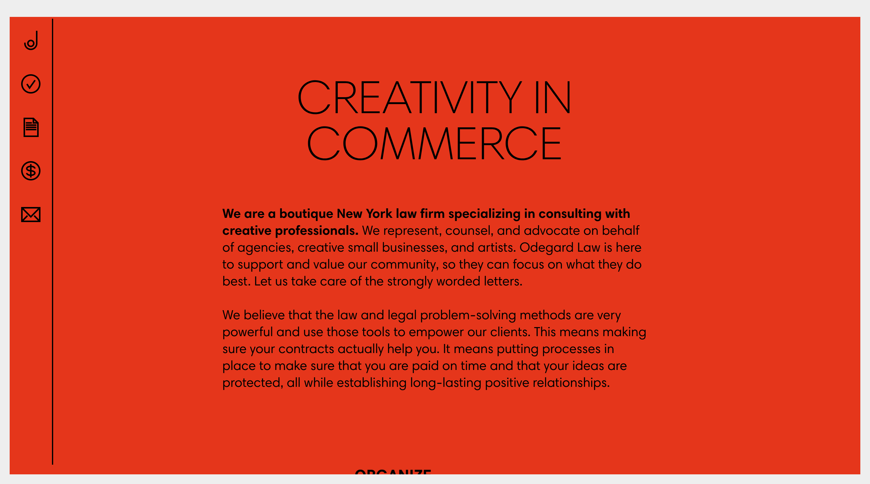
Odegard Law – This lawyer’s website utilizes a simple and clean design where each page follows the same layout, but with a different colour. Don’t let its simplicity fool you though. This treatment is a strategic choice for Odegard Law. It speaks directly to creative professionals, the firm’s niche market. This approach also reaffirms and illustrates the statement on the about page about allowing creatives to do what they do best while lawyers focus on the words. That’s exactly what this firm has chosen to do.
Category #4: Layout

Cooley – Colour blocks are used in an innovative manner throughout this law firm site, to provide the reader with expanded information relevant to the selected section. This was a risky move, as it could have created disorder and confusion about the hierarchy of information. But it was well executed and the result is straightforward, clean and interesting, just as intended.

Milbank – This law firm web design is laid out using a combination of a split screen at the top and blocks of text and colour throughout. The split screen is effective at organizing information in an aesthetically pleasing manner. It’s consistent, but not predictable. There are surprising background colours and photo treatments from page to page. It also happens to be a very mobile friendly treatment, though some of these more exciting design features are lost on phones and tablets.
Category #5: Animation

Hogan Lovells – There’s a box and it’s animated. That gets points for being unusual. But the reason we like this law firm website is for the symbolic reference to out of the box thinking. Paired with the firm’s tagline and follow up question, it tells visitors a story about what to expect.
Cooley – There’s a background video on the top of the home page. But the really cool feature in this example is the animated logo. It’s not just animation for the sake of it though. It plays a strategic role in reinforcing the firm’s priority message about innovation.

Bick Law – This law firm web design uses animation to create a bit of a storytelling effect.

Winston & Strawn – Interactive elements on the home page allow the visitor to get more involved in what they read, rather than being a passive viewer of the content.
Category #6: Writing style

Westaway – Text is conversational, even in the navigation bar. In a profession known for its use of legal jargon, beyond where it’s strictly necessary, this move is intended to reinforce the firm’s focus on change.

Quinn Emanuel – This is a recruiting page. But it’s a great example of text that tells the reader what’s in it for them, rather than just trying to sell them something (a common tendency in marketing).
Category #7: Contact Information
This is simply a note about a best practice. There’s much controversy over contact forms. Regardless, whether you decide to include them or not, best practices include making contact information available in a highly visible location, on every page of your site. Less is more when it comes to clicking around for your lawyer’s phone number or email address.
Category #8: Call to action

Fogle Keller Walker – True to the sensibilities of many lawyers and other professionals, this call to action holds back from being too aggressive or pushy in the initial sales cycle. The implication is that they know their visitors may not necessarily be ready to hire. They may not even be ready for a consultation. But it doesn’t hold back so much that it doesn’t qualify as a real call to action.

The Ross Firm – Not to suggest that a more casual call to action is better. It isn’t necessarily better. As with other elements of the site, the call to action should match the firm’s culture. That said, both of these examples are a creative spin on the typical ‘Book a free consultation’.
Category #9: Social integration

Feldstein Family Law Group – Social media marketing activity on law firm websites mostly range from sharing the twitter or blog feed in a sidebar or footer to including LinkedIn, twitter and even Facebook handles on every lawyer’s biography page. Going beyond? That’s the trick. Andrew Feldstein found a way. See the ‘Ask Andrew’ box above. It invites visitors to ask questions on Facebook during a live video show. Click and it will take you to a dedicated website with past and current episodes.
Category #10: Biographies

Bick Law – This is a seriously, good headshot. Seriously. And I don’t just throw around marketing compliments, willy-nilly. Here’s why it works. The expression on Krista’s face is warm and approachable. The photo is both larger and wider than most, which automatically gives it more presence, particularly because it fits into a customized spot on the page. It’s not just an add on at the top, per the standard approach to biographies. Beyond that, there’s a lot of thought that went into the background, which echoes the firm’s focus on the environment, and clothing which carries hues of the law firm’s logo colours. It’s subtle and professional and it works.

Boughton Law – This biography features a great headshot and a window into this lawyer’s story. For visitors looking for more information, there’s also a podcast featuring Serene as well as a link to her LinkedIn profile.

Mintz Levin – Here’s a modern, conversational biography, full of personality. It definitely stands out. Even the photo and the questions and answers below it tell you a lot about the individual and the firm. This isn’t actually from the Mintz website, however. They found their middle ground by launching a 2nd website, MintzEdge, dedicated to entrepreneurs. Visitors can click through to the main site for the more formal biography (complete with the photo in a suit, a stunning contrast to this one!). If you do click through to Heidi’s full biography, notice how the reader is not only given the typical link to the lawyer’s LinkedIn profile page, but also to her twitter handle and her blog posts. This level of social integration helps to strengthen bonds with clients.

Pillsbury – Technically not a biography, this is nonetheless an innovative way of presenting the firm’s people. In this example, we are seeing people’s stories and contributions, rather than simply a dry listing of resume points. This page is actually from the firm’s career section. It is a recruiting initiative.
Category #11: Firm profile

Hogan Lovells – The firm profile begins with a comment about the reader’s experience and their resulting needs. Only after that position has been established does it lead into statements about the firm. This is a great illustration of a ‘clients come first’ culture.
Category #12: Navigation

Orrick – In this law firm website example, navigation doesn’t just serve the purpose of getting readers from point A to B. It actually plays a role in telling the firm’s story. Five priority sectors have been featured in colour blocks at the top of the page. As well, when you click on one of the five, the border on the banner changes to match the selected sector colour. This effect reinforces a message about specialized knowledge, while also keeping the visitor oriented.

Shearman & Sterling – As the visitor drills down to the section of interest, three tiers of navigation stay open on the left. Aided by colour, icons and layout, this navigation system makes deep content accessible and organized. What does that tell you to expect from your lawyer?

Baker Botts – Conversational language like “I am looking for solutions” was used throughout this navigation system. It makes it easier for the visitor to find what they’re looking for. That said, this language style wasn’t further integrated into the text. Was it possibly to place more of an emphasis on the navigation system and the readers’ choices about where they go next? You decide.

Freshfields Bruckhaus Deringer – In almost magazine like fashion, teasers from the text appear in the drop down menu. Putting the information out there before the reader even asks for it looks proactive, confident and strong.

Drinker Biddle & Reath – This lawyer website presents readers with an almost puzzle-like, translucent menu on top of the home page background photo. What does that tell us? The reader’s choices take priority here.

Hangley Aronchick Segal Pudlin & Schiller – Though technically not part of the about page, there is a section on this lawyer website that provides the visitor with little anecdotes, presenting a window into the firm’s culture. This was done transparently and with a good sense of humour. But, as you can see from the screenshot above, although they poke fun at themselves, in the process the reader walks away with a positive impression that even transfers to skills related to the practice of law.
Category #13: Mobile

Skadden – Nobody needs to be convinced that websites need to perform well on mobile anymore. And most do. But some do it better than others, primarily because they were designed for mobile first. Here’s a good example.
Category #14: Function
Without getting into the developer’s bag of tricks, there are lots of free tools out there to get a quick read on your website’s performance. This will give you a high-level view of web function including speed and security. Check out HubSpot’s Web Grader. The report also covers SEO tags and mobile. It’s very visual and an easy read. If you’re mainly concerned with mobile performance, you can check out Google’s mobile friendly test. Don’t lose the web battle before you’re even out of the gate with a slow site or one that doesn’t open properly on certain browsers, monitors or devices.
Category #15: Other Content

Kilpatrick Townsend – In addition to some of the standard information found on most lawyer sites, some firms include additional content such as event calendars, sub-brands, cultural background, a section on diversity… This example places emphasis on the firm’s charitable efforts. While many lawyers make generous, charitable contributions, they can often go unnoticed (and granted, for some that’s a choice). Impact (used above) is the right word, however, for a law firm that wishes to generate awareness of such activities.

Freshfields Bruckhaus Deringer – There’s an alumni section on this website. That’s not altogether unusual for a larger firm. But this law firm website goes as far as featuring their stories. What’s in it for the firm? It builds goodwill and a solid network. You can bet this strategy takes some of the heat off the firm’s recruiting efforts. Alumni won’t be as large for smaller firms, obviously. But the concept of making space on your website, to reinforce a network or showcase people, translates to any firm, regardless of size.

Gloria Allred – It’s a nice little boost to the ego when the firm or one of its lawyers gets prominent, media attention. But, often it can be no more than that. Unless you leverage it, that is. This law firm web design is a good example of showcasing media coverage. Excerpts are prominently displayed on the home page, the media page and throughout. There are also design elements elevating this content, beyond the typical list found on most lawyer sites.

Caravel Law – The areas of practice section on law firm sites are usually pretty dry, focused on maximizing keywords and explaining service offerings. This example, instead, focuses heavily on process. The point here is to use your website to illustrate anything different that you actually do. How else will someone know if your firm is a fit, sight unseen?
Category #16: Search Engine Optimization (SEO)

Osler – You don’t have to sacrifice branding or other aspect’s of your law firm’s identity for the sake of Search Engine Optimization. See how search results for Osler present a dignified presence while also incorporating their keywords? They made sure to not only include the firm name, but list it first in the sequence of text for the title tag. The name in short form is then repeated at the beginning of the description tag, reinforcing the sentiment that the brand comes first, not SEO. It’s a subtle move. But it affects the impression a firm makes, particularly if it’s a first impression.

Birenbaum, Steinberg, Landau, Savin & Colraine – If you’re at all familiar with the backend of a website, you’ll know the terminology for the various levels of headings: h1, h2… Well, Google refers to these headings to better understand the hierarchy of a page. That said, it’s considered a good SEO practice to include keywords in these headings, especially the h1 and, most especially, the h1 on your home page. That usually results in a conflict between good writing for your welcome message to actual human beings and the keywords for the robots. Here’s a good example that does both.
Get a return on your law firm web design
How do you know if you got it right? Figure out what success looks like for your law firm website and measure it! What are you trying to accomplish? Drive traffic? Filter inquiries? Inform? Recruit quality candidates? Get media attention? Create a hub for marketing activities? Establish a professional identity…
Whatever the ‘it’ is for you, does your site meet your goals?
At Bekhor Management, our approach is focused on what really works to build and enhance small to mid-sized, law firms and other Canadian, professional services firms. We invite you to book an initial consultation if you’re looking for assistance with any aspect of your law firm web design.
—
Related articles on law firm websites:
Law firm logo design – An exhaustive illustration (42 leading examples critiqued)
7 Law Firm Marketing Myths Debunked!